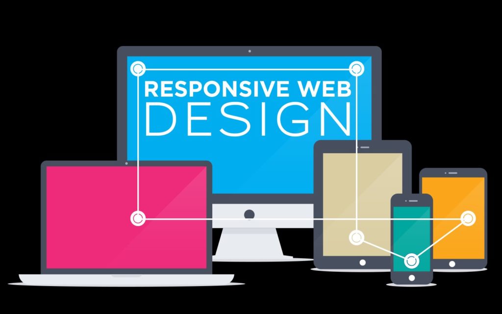
Minneapolis, MN – Responsive web design 2018 (RWD) is a web design approach that optimizes a web viewers experience which helps web users to easily navigate your website with minimum resizing, panning and scrolling.
Therefore, a responsive site will have different layouts across a wide range of devices from your desktop computer (PC) monitors, tablets or smartphones (mobile phones, iPhones).
As many of you have noticed, smartphones and tablets are becoming an increasing popular way people are surfing the web.
Tablets and smartphones have completely changed the landscape of how people surf the web and they use built-in web browser that connect to the internet through wi-fi or their cell phone providers.
This means that your customers are using their mobile device or tablet to find you on the web. Last I read it was up to 50% of web users look up sites with their mobile phones.
Why do I need a Responsive Website?
Responsive web design has become the go to design technology for business websites.
Why is responsive web design the answer for your business?
With the changing web device landscape and users being able to browse the web on their phones it became necessary to create a web technology to bridge the gap between traditional web design and mobile websites.
So, in “response” to this the web design community started creating websites that were build with responsive web design, thus killing two birds with one stone!
Go were your customers are with a Responsive website that will look great on a smartphone, tablet or any desktop monitor!